My thoughts on the 2026 Formula 1 liveries
I just woke up and I’m groggy as hell, but the Ferrari livery is so ass I had to make this.
“2026 will mark a new era for Formula 1”, a phrase I’ve been hearing for the past 3 years. I’m excited about what’s coming and I can’t pretend I’m not, but the constant re-iteration of that point makes for very disappointing discussion about the sport’s future: Practically everything has built to this season, from Lewis’ shock Ferrari transfer to five rookie signings in the same season to Audi AND Cadillac AND a billion other title sponsor partners from HP to Atlassian to whoever is giving Cadillac enough money to field Zhou Guanyu as a reserve driver. If you’re in F1, or even just into F1 at all, 2026 is supposed to be your year; it’s like everyone was bored of the last era of Formula 1 regs not even moments before they started; at least, until McLaren started to actually have a chance.
With 2026 in mind, the moment everyone has seemingly been waiting for, the cars have (begun to, as of the time of writing) roll out, and with them comes a new set of liveries to review. I began talking about the F1 liveries last season in a private Discord server, but with the new season underway and a fresh outlook on things, I think it’s a good idea to review them here. Given the first paragraph of this, I’m not super looking forward to the others, but I’ve got to try.
All images sourced from the F1 website.
1/15 - Red Bull#
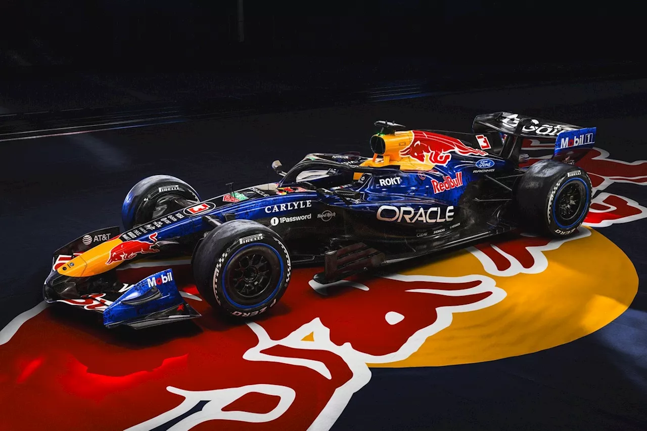
That’s a pretty nice livery, actually. I honestly think the biggest complaint I have is the team shirts.
Red Bull’s partnership with Ford opens up a door for them to return to a more vivid blue, one that the team is somewhat acquainted with from their older days. I love the front nose of this thing; active aero will probably see the team putting the logos on the front wing in more parseable spots naturally (though honestly, I forget how active aero works, so that’s probably a bit far-fetched). I think my biggest point to this car is that, despite being and feeling very modern, it’s got a very retro feel to it as well at the right angle, though I think that’s just a consequence of the 2026 regs themselves. One thing I didn’t immediately notice was the busy patterning on the blue itself; while it’s busy, it’s clearly a weight saving move that matches the underbody of the car in an unobtrusive way.
Again, my biggest complaint is 100% the team shirts: The blues don’t match in my eyes and pops too much on Red Bull’s standard issue blue. It’s going to be awkward seeing a crew in a lighter blue standing around a darker car; maybe there’s merit to the unpainted sections below the car as contrast, but it still feels awkward.
All in all: Not bad. Besides those weird dots, the livery is a nice throwback in simple colors with generally tasteful changes.
1/15 - Racing Bulls#
With Red Bull comes their chud ass little brother. I hate them and what they stand for; basically everything about them, except for how good their car looks.
Racing Bulls didn’t really need to change much this year, but what they did change makes the car that much more beautiful. The Ford blue is tastefully applied, while the car retains much of the white that I love so much and the front nose that the Red Bull cars do very well. I’d argue that any modern Racing Bulls car handles the color scheme better than the Red Bull cars do, even, but maybe it’s just me being biased towards a white car like this.
Impressively, I don’t think I have a single complaint about the Racing Bulls livery; they do some of my favorite liveries on the grid, as well as in general. It’s just a shame that Racing Bulls has to be the brand representing it.
1/19 - Haas#

Ah, how the teams I hate have beautiful liveries. This time, it’s a team I’m fine with in modern-day action, at least.
This one’s another beautiful white livery that tastefully weaves in a good red and black that Haas are known for in recent years without the black being obtrusive like it was in past years. Even the Gazoo Racing sponsorship logo feels like it has a great place in this package. This feels like the most visually stunning and confidence-inspiring livery I’ve seen Haas have… ever.
No questions asked. I am just stunned. Every detail is perfectly placed. It’s shocking how much I like this one. I wonder if there’s a Toyota buyout in this team’s future to make me hate it less.
1/20 - Audi#
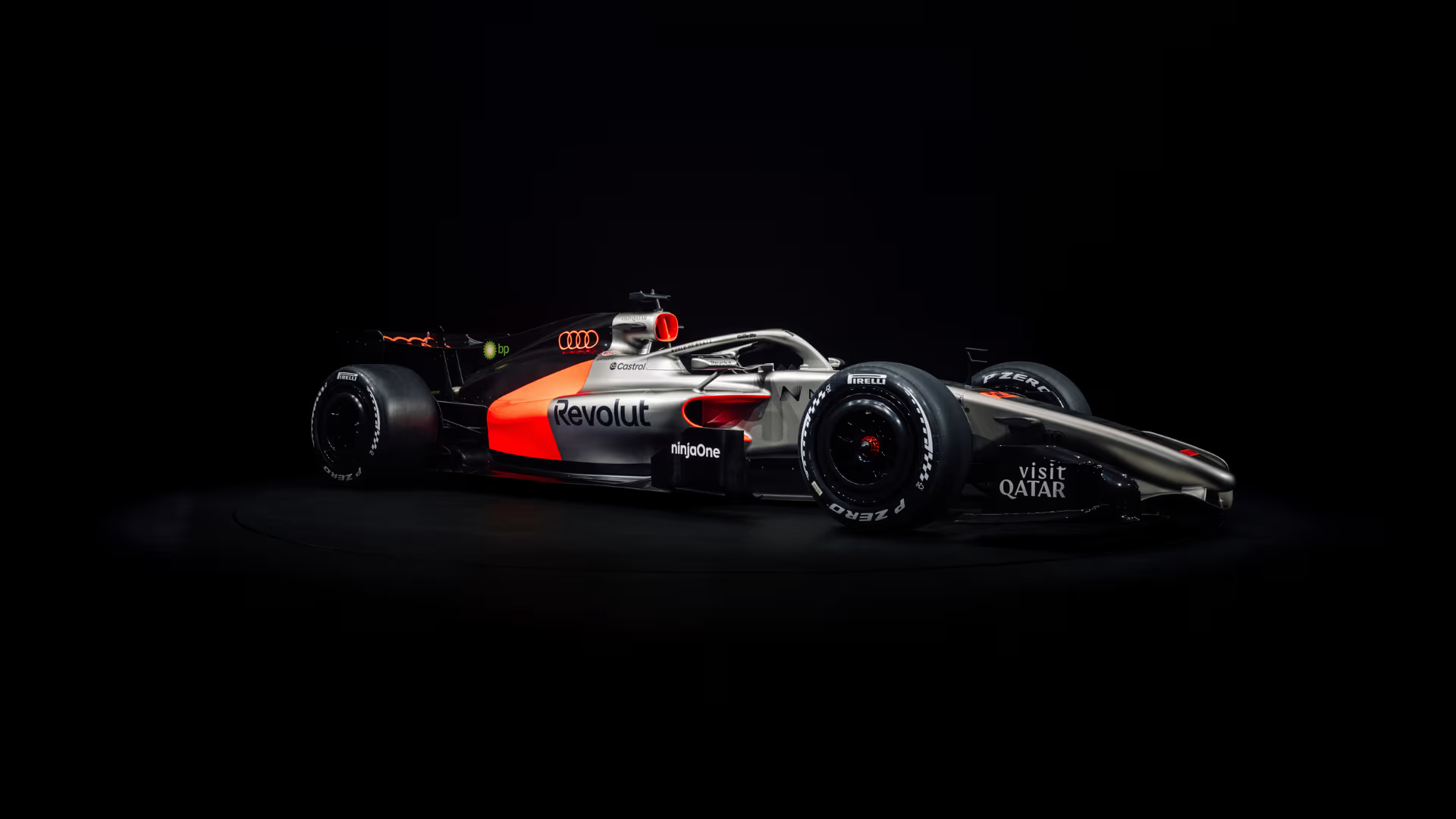
The biggest rebrand on the block sports yet another stunning livery that comes as a huge surprise after their 2023 concept seemed so different. I could say I’m disappointed that they didn’t do something with that level of personality, especially because this feels like it should be a McLaren throwback livery with the glossy paint, but on its own, it stands tall, proud, and beautiful.
What I love most is the use of both the titanium and matte dark gray and the contrast between them being the core of the livery, which gives the red a lot of focus without being overly dominant. It makes the livery a very nice middleground between many of the teams that are present on the team currently and allows the team to inject its identity onto the grid without sacrificing its colors, even down to their red being as unique as it is. It’s a neutral base with incredible usage of accents that’s incredibly clean and doesn’t let its sponsorships bog it down (save the BP sponsorship that has the HP problem, but handles it well).
In short: What a way to make a visual entrance to the F1 grid. So far, it’s my favorite livery this season, an honor I thought would’ve gone to one of the white cars at first. I’m excited to see this one on the track.
1/21 - Mercedes#
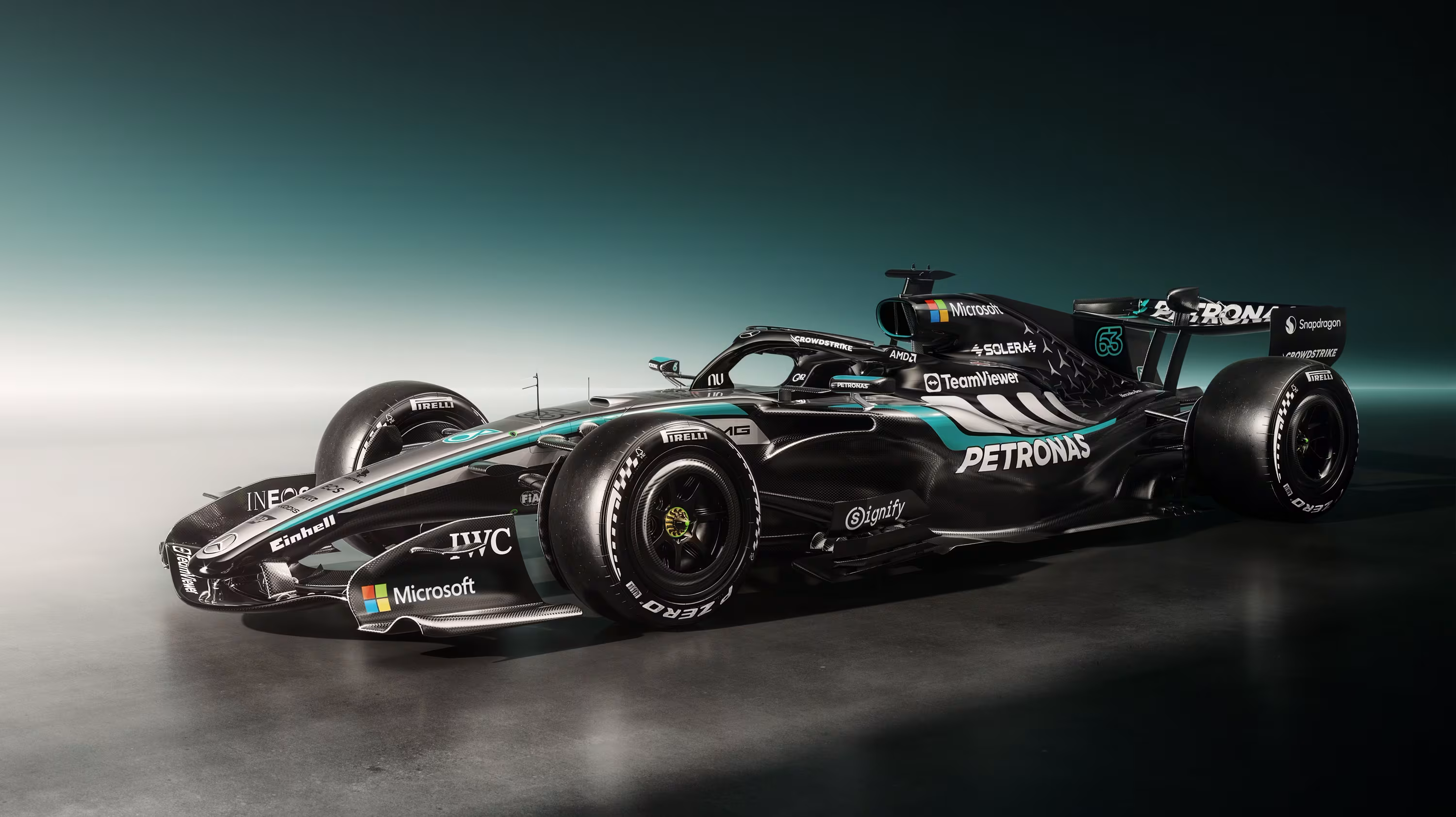
Mercedes has learned from their past livery mistakes and made something busy that still works well and is drop-dead gorgeous at certain angles.
Mercedes combines many of their best livery decisions in the modern year into a single car. It’s a bit much, I have to admit, but that doesn’t mean it’s not very nice; I love the detailing down the side in the grey and aquamarine and the silver arrows lining the rear body in standard Mercedes fashion. Those blackout sections speak to the identity of the modern Mercedes F1 team in a very nice way.
There’s just one thing about this livery that pisses me off, the same thing that’s pissed me off about the liveries before it since 2024: A silver nose on the black body that’s so out of place against the backdrop of the modern Mercedes. It’s the worst, silliest detail on a car that is otherwise very nice. I’ll give Mercedes that they’ve made the nose a more palatable touch with a bit of grey covering on the sides, but it still has to fade into black somewhere and chooses to do so in a not-so-great spot.
When Mercedes unveiled the first livery with a silver nose on a black base, they touted it as a unity of past and present. This livery looks beautiful from the front. This livery looks beautiful from the sides. It looks ugly on the diagonal. Where is the unity here?
1/23 - Alpine#

Alpine’s greatest tragedy is that BWT pays them this much to be a title sponsor, so much that they can’t even invoke their own brand identity.
For one, I love the direct Alpine is trying to take here with their car; it speaks to older Alpine, and the metallic sheen is a nice, rarely-used touch in a color as bold as this. The blue base is, in my opinion, the best touch Alpine could ever ask for, properly evocative of who they are. It’s a shame that BWT had to come in with a can of pink paint and ruin everything.
The pink on blue that the BWT sponsor logo and other car accents paint on manages to be even uglier than the massive pink stripe Alpine has gone for in recent years; by continuing to incorporate their pink into the car, Alpine is forced to deal with a poor color combination over massive swaths and segments of the car. It’s not even like BWT, either; their best and most iconic liveries are the ones where the logo and pink highlight just cover the car entirely, being the main centerpoint rather than fighting with Alpine blue for attention. It’s a bit of a mess, put bluntly.
In short: Pick a side.
1/23 - Ferrari#
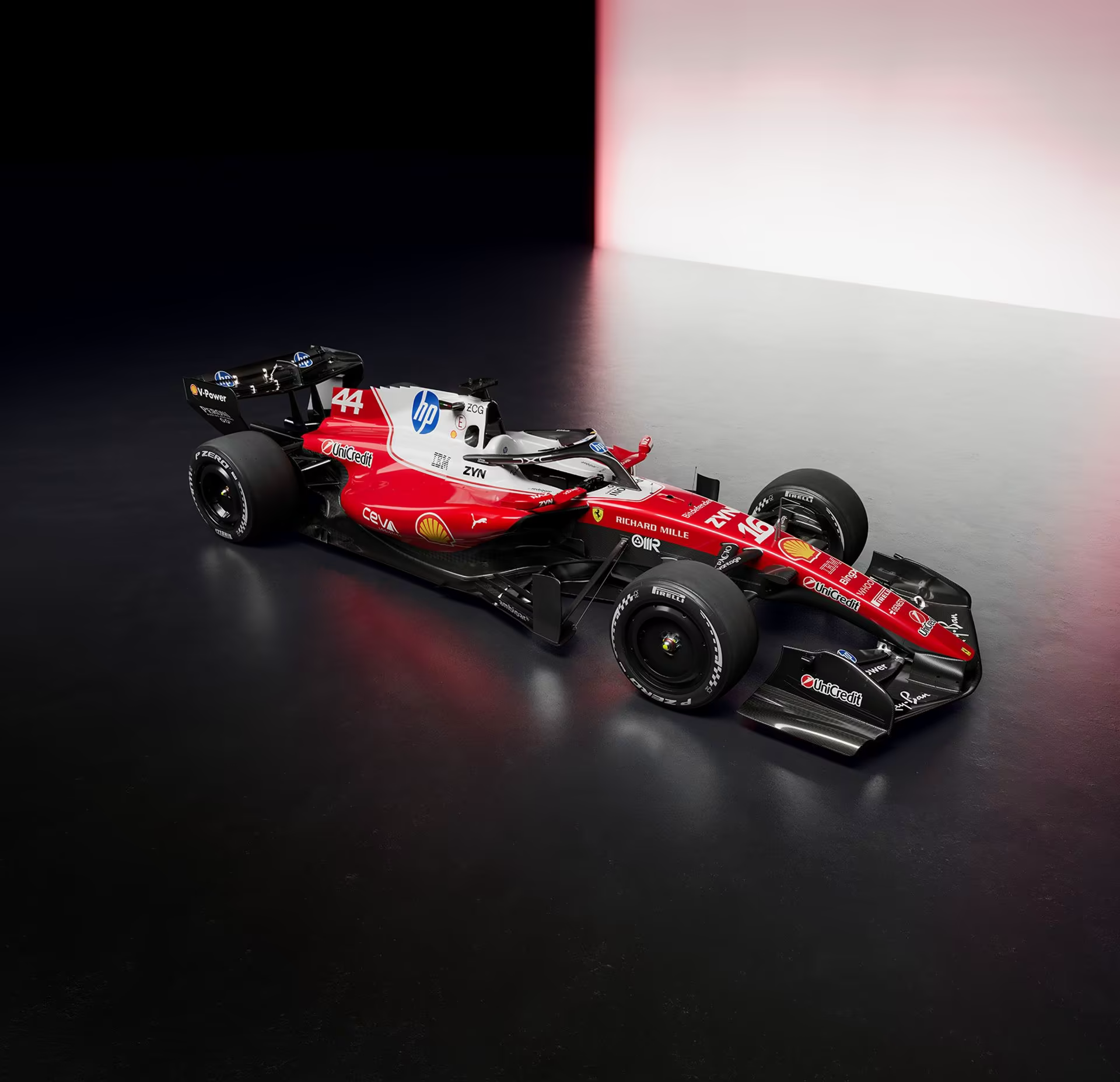
This? The year I decide I’m going to try being extra chill with Ferrari, this is what they make me look at? I might actually cry.
I know what Ferrari is trying to do with the massive white splotch on top of the seat, with HP seemingly mandating that their logo has to be blue and all and them needing to integrate it into the car somehow. I, for one, have adored Ferrari’s red and white liveries historically; I loved their Las Vegas 2023 livery and thought that their 2025 livery did this exact same thing fine, despite all I have had to say about Mercedes. On the other hand, where is the rhyme or reason here? Why does it feel like the HP white is expanding like mold? Who designed something so horribly placed when cars approaching the grid this same very year, from Audi to Mercedes, manage to do an accent color like this even better than the team with enough history to learn from this mistake ten times over? In fact, how does Audi’s literal second ever livery manage to do what Ferrari wants to do this much better?
I just have to remember that, even if I like to see other teams win, I’m a McLaren fan at heart.
2/3 - Williams#

They didn’t mess this one up nearly as much as they could’ve. Doesn’t mean I have to love it at all, though.
This is a team that really shouldn’t have the Alpine problem with BWT, but this livery is giving that impression. Williams barely plays off of the iconic sponsors I imagine fans have been dying to see on the car, instead adding blocks of light blue for Barclays and white for Komatsu that feel awkward on the car; plus, that front wing with the white strip doesn’t really do that angle justice, either. I at least think the Duracell logo placement is fun, but that’s not really much. I don’t normally comment on the wheels, but they’re definitely the worst part here, with whatever gambling site shilled out the hardest to Williams throwing a blotch of paint that matches nothing of the rest of the car. It’s the same principle that I love when it’s implemented on the Audi car, yes, but the shape and size of the blocks of color are awkward.
I’m also going to take the opportunity to dig at the shade of blue they used, at that. It’s a bit too light. It’s awkward. It actually reduces the contrast with the light blue and white that should pop out in a beautiful way. This is maybe the dullest Williams livery I’ve ever seen, and it’s unfortunate that I’d rather Alpine get my vote for best blue livery this year.
It definitely saddens me that this design of all of them fell off this year, because Williams is a team I’ve always liked.
2/8 - Cadillac#

And now, Cadillac enters a different motorsport with… something completely different? I thought this was going to be more like their WEC car, but we get peak instead.
Alright, I’m biased here. A pure black and white livery, even down to (most of) the sponsors, is so incredibly cool. The gradients are surprisingly tasteful, lining the entire car for a very unique look, and for all I don’t love the scattered lines near the back, they do wonders for the brand identity and, from the back, almost have the same look as the checkered flag, likely not intentionally. This is a team with an identity that deserves to be represented on the grid, whether in the points or not.
While I don’t have much to say, I do think there’s still a point to be made in the other direction. I love white liveries, but as it stands right now, there are three of them on the field, including three nearly white team color markers on the online boards, one of which is a team that isn’t running a white livery. I imagine this livery will stand out greatly at the races, yes, but it’s going to make actually sorting through records a bit hard.
I think I’ve made my point clear enough. If you wanted Americans like me to look at your car, this is a surprisingly bold move; familiar, but in a novel way.
2/9 - McLaren#

If it ain’t broke, don’t fix it. A simple livery that speaks to the team’s identity indicative of past champions. For all I hate Google’s presence, in particular Gemini’s presence, on this car, being so flagrantly AI colored, I’ll at least enjoy looking at those wheels more than I have in the past in this era.
I’ve always loved everything about the new era of McLaren liveries (except for those rims): They’re simple, striking orange with black patterns I dearly love. It’s in part bias for the team, because obviously, they’ve done nothing interesting here, but that’s not to say I can’t like it at all; I think they’ve settled on their direction quite well and it speaks to a solid brand identity better than a lot of the teams on this grid are currently doing. I like what seems to be a slightly longer chevron on the nose of the car; it’s certainly not like the Marlboro liveries, but having one with the big black stripe on the back got me to pattern recognize it when I saw this at first.
As I mentioned before, there’s one striking detail that I hate about these liveries that stops me from fully appreciating them, being those annoying rims. Google has enough say in this team that they can print their four-colored mess on these wheels every season; now, with the advent of AI sponsorships, including swapping out Chrome for Gemini entirely, the wheels are a lopsided mess that probably won’t even be noticed during the race. With how much more blue they are, I do think they’ll be less annoying to look at, being a solid color that speaks to the previous McLaren era, but it’s muddled together with colors that aren’t quite so pretty on a car like this.
I don’t care as much as I should. I want to see them do well this year, champions or not.
2/9 - Aston Martin#
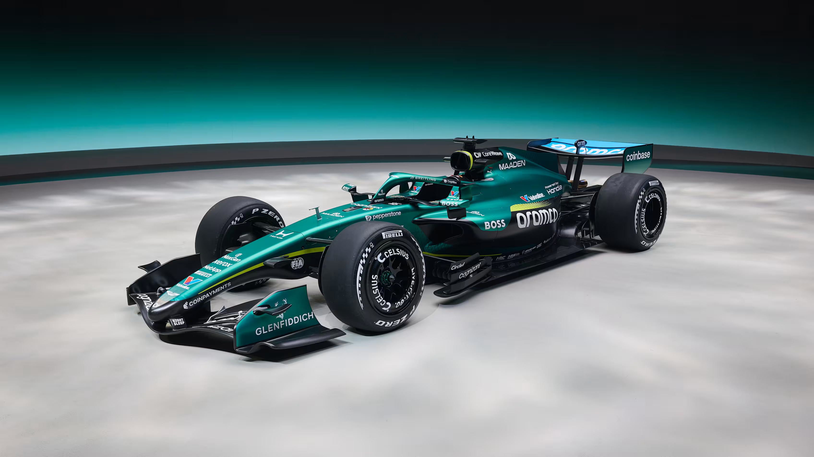
This being an online reveal is very disappointing. I think I’ll be biased against this car a bit thanks to that, as the lighting doesn’t really do it justice, but let’s see what we’ve got here anyways.
A smooth, tasteful black underbody and front wing. Tasteful highlights in the British racing green with the body being that striking darker green that I like. This feels like another example of “if it ain’t broke, don’t fix it”, advice that Ferrari really should’ve taken back around Vegas ‘23, so there’s ultimately not much to say about this livery except for the fact that I like it a lot. I even like it down to the wheels, too; having black and white wheels on the body of a car like this will make it very pleasant to watch. Even the colors on the rear wing are relatively unintrusive for the palette, unlike a lot of the logos on liveries this season; however, that might just be because it’s rear wing only and aramco knows its place not to paint over those black sidepods.
Clean and effective, far more than I feel like their journey this season will be. A nice way to end off this list.